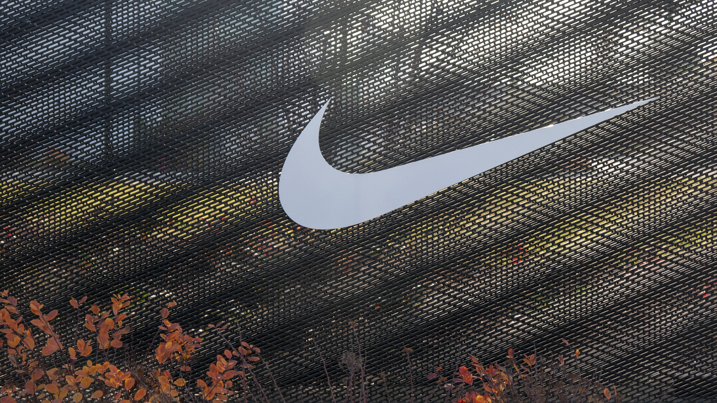
Nike Signage
Nike World Headquarters is the expansive home base of the largest sports footwear and apparel company in the world. Located on a sprawling, 400-acre campus in Beaverton, Oregon, just west of Portland, the site houses more than 11,000 employees and encompasses over 75 architecturally diverse buildings and structures, including the Nike Sport Research Lab and the Nike Museum, three fitness centers and facilities for athlete training, as well as sports fields, track and running paths, the manmade Lake Nike, and several dedicated stops on the local MAX light rail system.
Pentagram and the design team developed a comprehensive signage and wayfinding system for the corporate headquarters in partnership with Nike Construction and Design. The project framework included the structural design of the signage and graphics for the program, including maps of the campus and its transportation network and custom icons. The design draws on the 26-degree angle of the brand’s iconic swoosh and the chevron motif of its famous Windrunner apparel to create a system that is uniquely Nike.
The challenge for the designers was to develop a signage program that would identify and unify the headquarters and the buildings. Nike needed a cohesive system that would visually connect the huge campus, integrate it with its suburban setting, hold its own with the strong architecture, and at the same time help create a sense of place.
Nike prizes its heritage as a sportswear pioneer and this history and culture is an important part of its brand. The designers wanted to pay homage to this legacy in the system and developed a mesh perforation for the signage structures based on the 26-degree angle.
The angle is both subtle and ubiquitous in the brand’s visual language: it appears in the familiar chevron motif on Nike apparel, on shoebox graphics, and in the pattern of the soles of Nike sneakers. Once noticed, it can be seen everywhere, including the tilt of the Nike swoosh itself.
The signage brings the angle to life in the pattern of perforated mesh that covers two sides of the box-like structures. As people move past and around the signs and look into the mesh surface, a layered moiré pattern is revealed, creating a dynamic optical effect that resonates with the movement and energy in the Nike brand.


