01.jpg

MahaNakhon

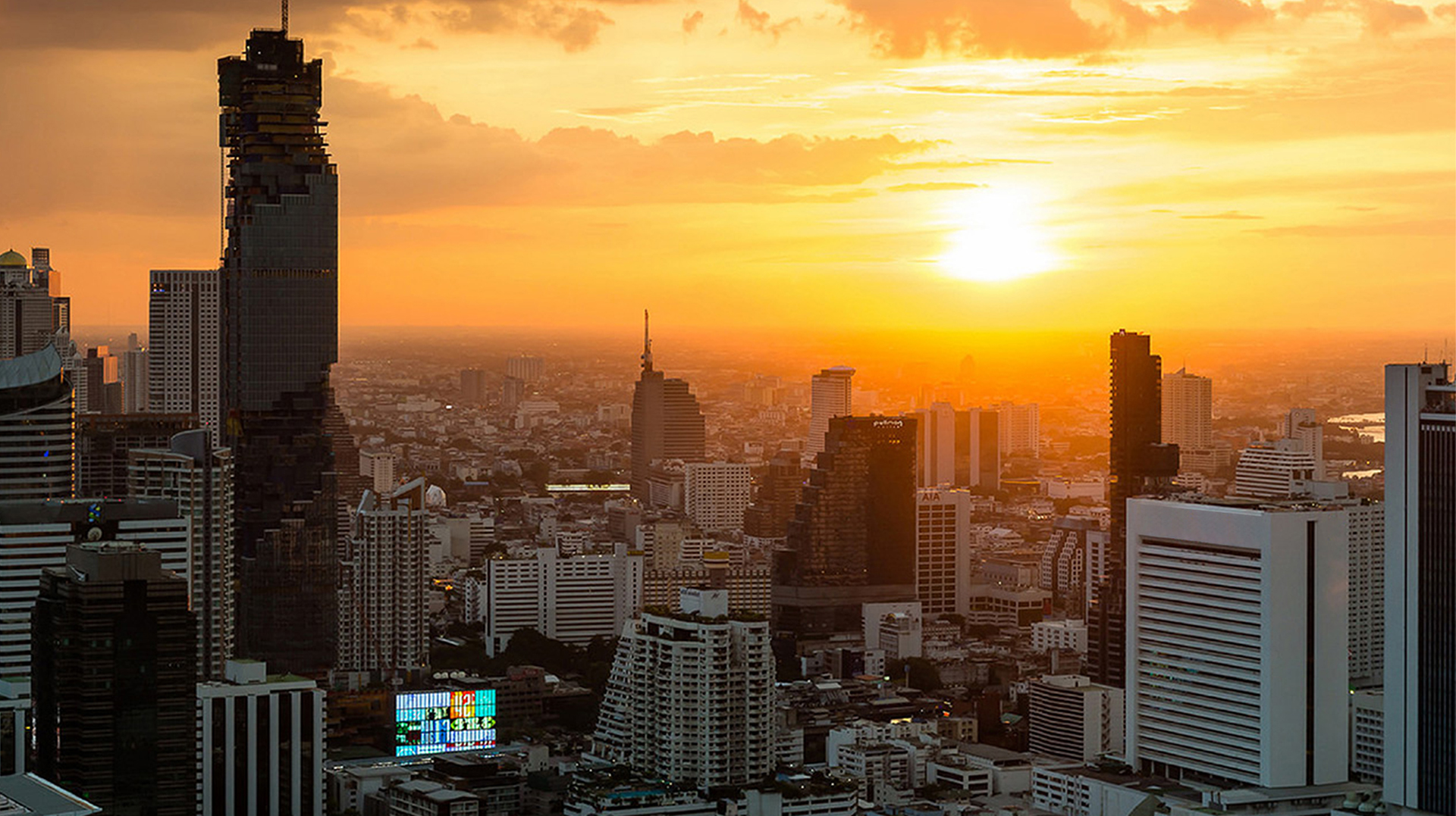
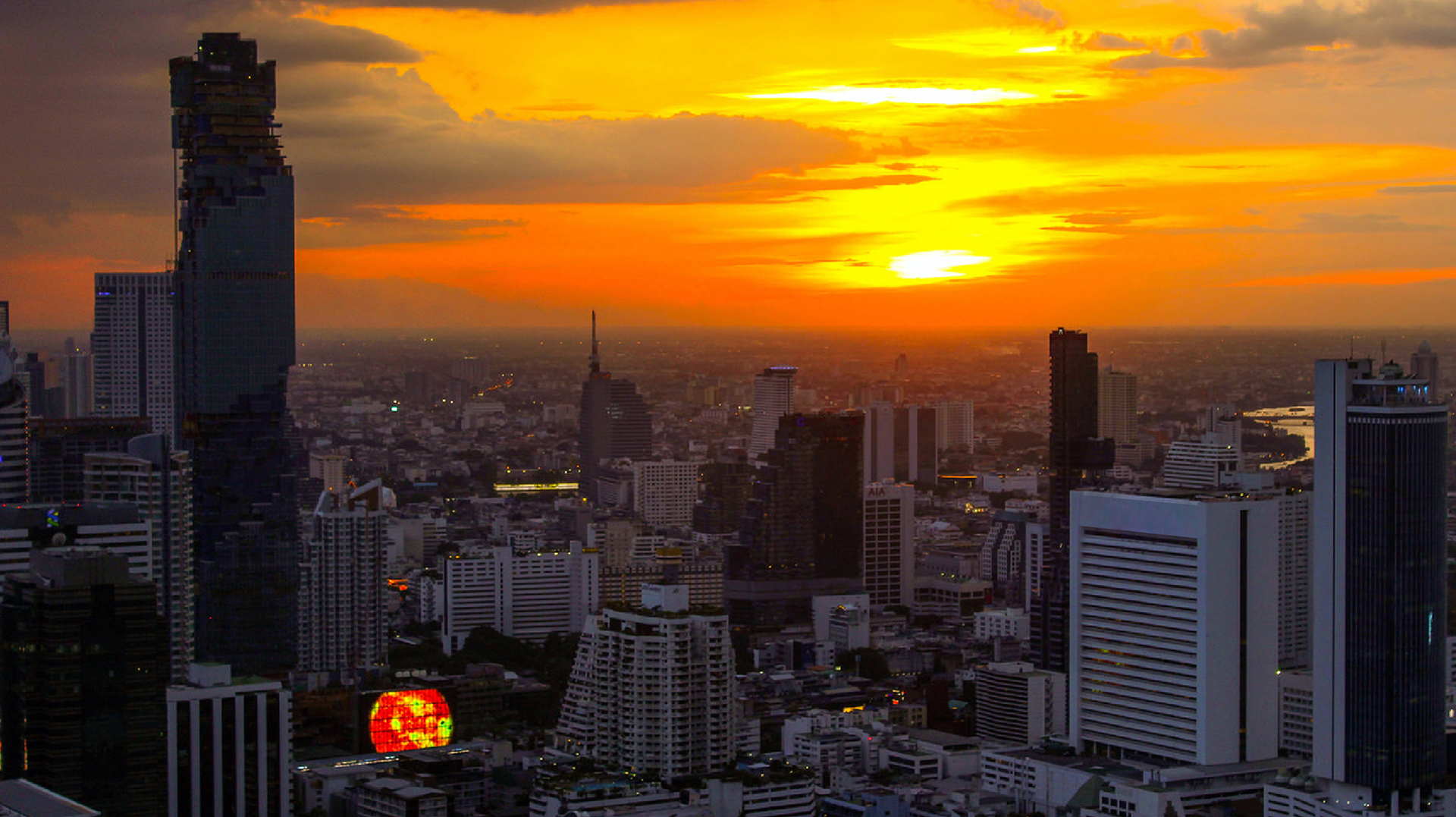
MahaNakhon is a high-rise mixed-use complex located in the heart of Bangkok’s thriving Central Business District. Designed by architect Ole Scheeren and Eric Chang of BuroOS. Developed by Pace Development, the 77-story building is the tallest tower in the city and has a distinctive pixelated profile that appears to dissolve in the skyline. Pentagram designed a program of environmental graphics for MahaNakhon, including a dynamic digital façade for CUBE, its retail component, that enhances the architecture and integrates the building into the dizzying cityscape.

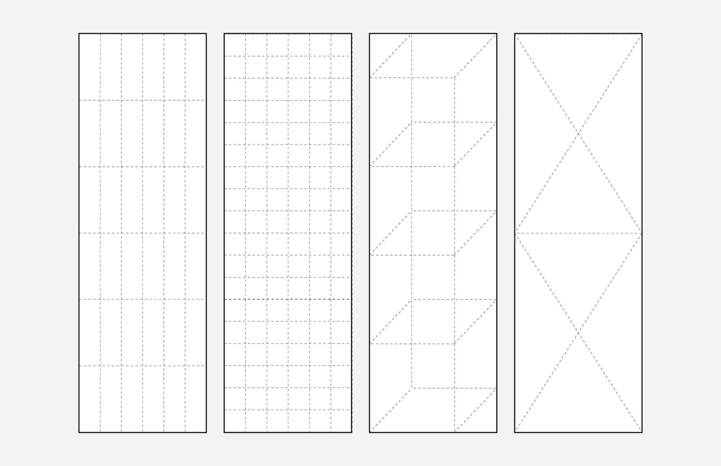
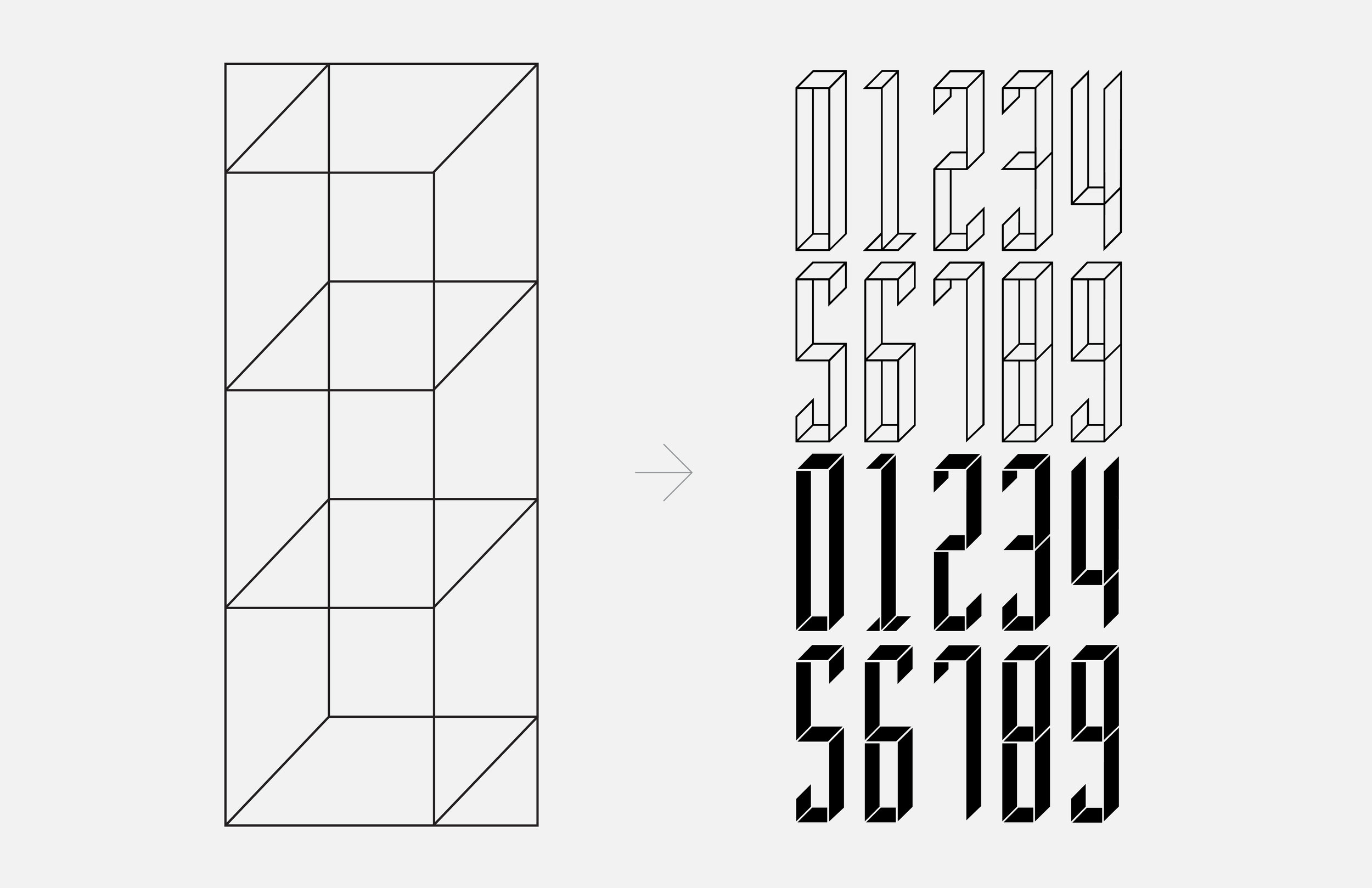
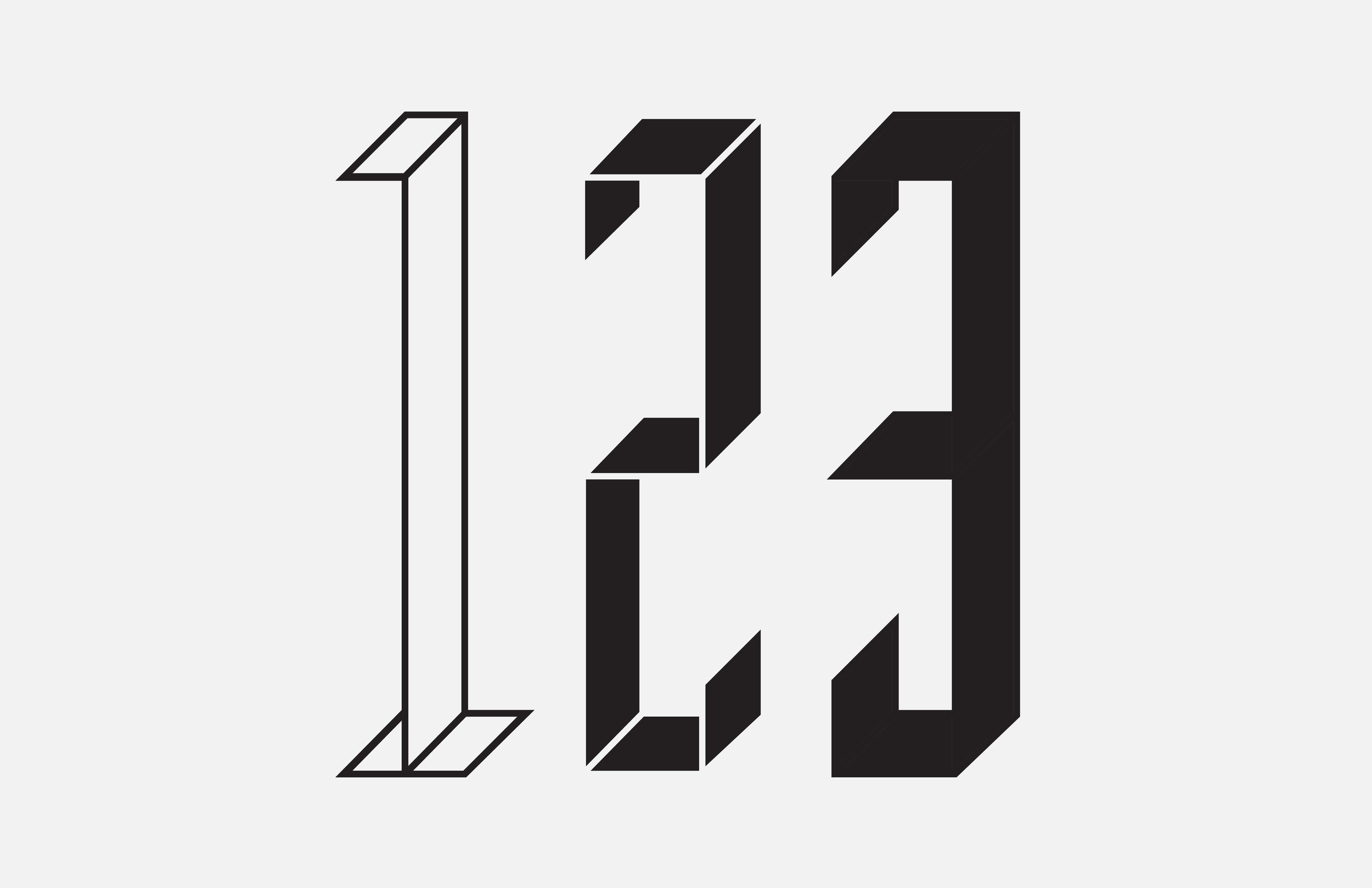
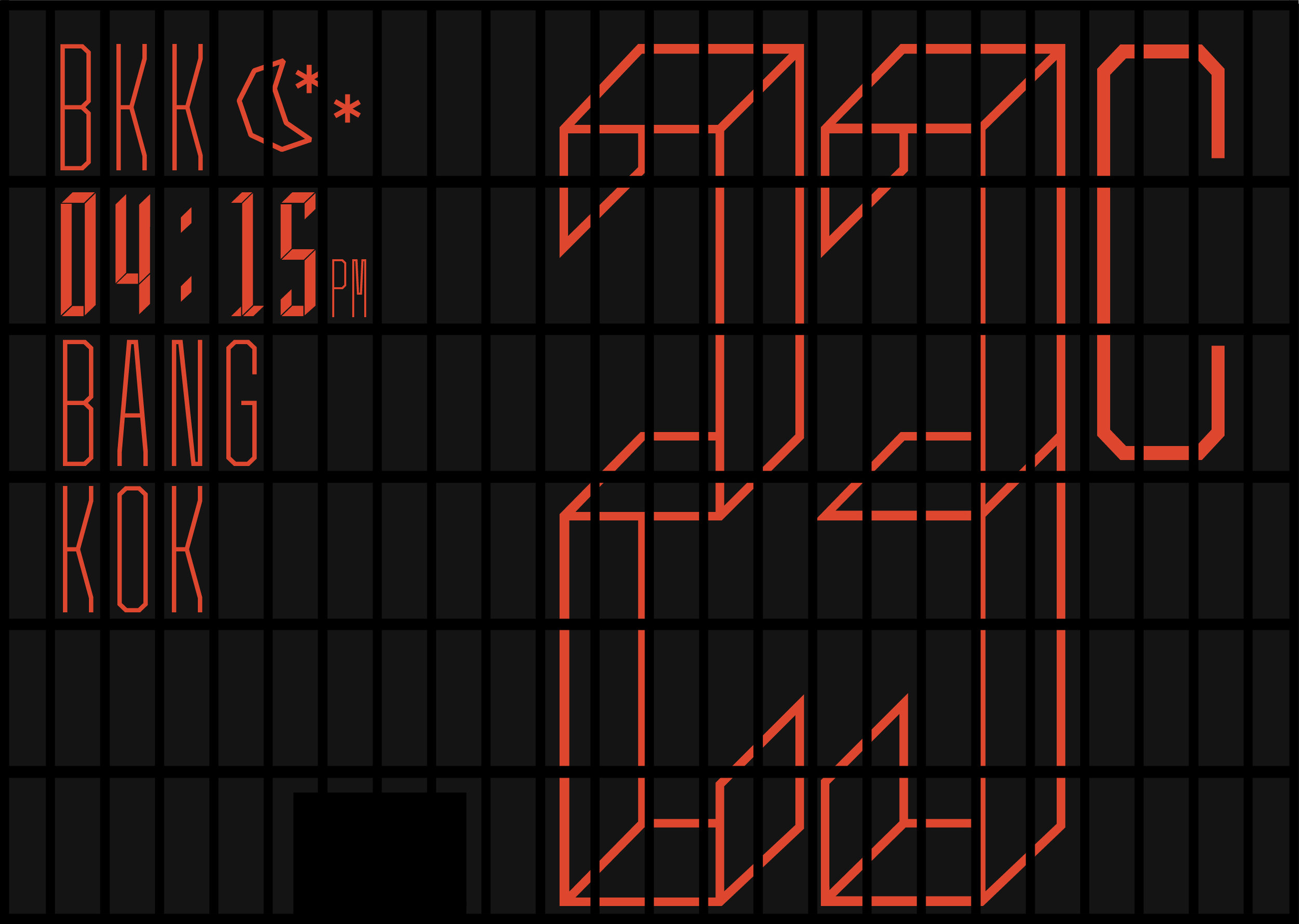
Pedro Mendes and the Pentagram team developed a visual language for the framework of elongated panels. The façade is divided into monospaces, which systematically organize all content. A custom typeface was created for the monospaces, where letters can expand or contract in size, depending on scale. The graphics and images are rendered with a diamond-based pixel system, or trixel, which gives them a shimmering, faceted, jewel-like quality. The program includes custom icons for the weather and dimensional numbers for factual information like financials and temperatures.

Project Credits
Pentagram
Eddie Opara
Brankica Harvey
Pedro Mendes

Developers
Kiattiyot Panichprecha

Awards
Communication Arts
2017

SEGD Merit Award
2017

Creative Review
2018

Client
Pace Development

Architect
BuroOS

Photography & Video Credits
Pentagram
Pace Development

Music Video Credits
Grimes - Genesis

Screen Cassette Structure
02-02.jpg

The vibrant installation helps MahaNakhon communicate with the city from the ground up, capturing the prosperity, diversity, and exuberance of Bangkok. 


1. Screen Cassette Structure
2. Basic Basic / Advanced Grid / Dimensional Grid / Trixel Grid
3. Akkurat Mono / Monopixel
4. Cube Logo
5. Monopixel Typeface

02-06.jpg
02-07.jpg
02-08.jpg
02-10.jpg
02-11.jpg
08.gif
02-12.jpg
02-04.jpg

The wall features news, advertising, cultural elements, and images of and information about MahaNakhon. Within the grid, the designers devised a system that accommodates various types of content that corresponds with a color palette. The images play across groups of panels, dematerializing the façade into a pixelated, ever-changing array, echoing the architecture of the tower itself. 

01-01.jpg
01-02.jpg
01-04.jpg

The facade has two distinctive color modes. Daytime displays vibrant color backgrounds with white content over it, and as the night falls the installation is transformed into a glittering, neonesque landscape with a dark background and colored content.

01-03.jpg
07.jpg
03.jpg
02.jpg
05.jpg
01.gif

Time is also used as a design element to create a context for the wall within its environment. Sequences of the sun and moon rising and setting are timed and computationally adjusted to parallel the actual celestial movement and angle, while tropical scenes bring a flash of green and blue into the urban setting. 

06.gif
03.gif
09.jpg
06.jpg
MHNK_blog_post-37.jpg